As usual it's taken me a day or so to think about this challenge and to try out various stamps, colours, layouts etc. I've come to the conclusion I'll never be someone who can make a card in "5 minutes", in other words I spend a needless amount of time 'faffing' about and this week is no different!
This was my original card but I felt it wasn't quite right, I think the letters are too heavy for the heart ..

so I tried it without the letters, which I think is better ... do you agree??
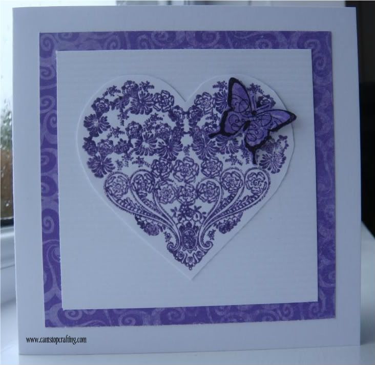
The heart image is Papermania 'Confetti' stamped in Dusty Concord Distress Ink and clear embossed. Mounted onto textured card then Bo Bunny DP. Letters cut from Tim Holtz Vintage Market Die. Butterfly is K & Co 'Madeline', stamped in Versafine Imperial Purple & clear embossed.
Wishing you all a happy week. (I've got a busy week this week but I'll try and get round as many of you as I can!)
Suze x
29 comments:
Hi Suze
CAS cards are harder than anything I agree!
I also agree I prefer without the letters. however. if you mount without the border, to have more white space I think it would work brilliantly! Fro me the border is compressing the design
Thank you for your continued loyalty
Diva LIM mandi
Less is More
I think I have to agree! Mind you the heart and butterfly are sooooo pretty they didn't need the lettering!
Kathyk
Hi Suze,
I like the idea of your butterfly as the o in love and would be great as a card on it's own but really like your second one. The heart is so pretty with just the butterfly. Gorgeous colour. x
I think both of your cards are lovely, stunning colours. Jo
Yes I really like the heart with the letters but feel it would not need the border as it is so pretty. Sue x
Both great, but I like the one without lettering the best! Hugs, Valerie
Hi Suze, Fabulous card, I think it's just lovely. You're quite right the image is really beautiful and doesn't need the words:0) xxx
Beautiful cards, I like it with the letters! The butterfly as the 'O' is a fab idea!
Beautiful cards Suze. Hugs Rita xxx
Beautiful cards, I prefer the one without the letters
Beryl x
Yes without the letters is much nicer! sometimes the image says much more than mere words every could. XOXO Zoe
I like both versions actually - perhaps if the background image was a lighter shade of purple the letters would stand out better?
Both beautiful cards Suze, but I suppose if I had to choose it would be the second one. I love the colour too. Dianne.
wow, I like them both ways as much, think you should make a set of different ones!
Happy Crafting, Debxx
Hi Suze
Thanks for stopping by. Love both but think I prefer the top one with the letters, but I'm in to fonts and lettering at the moment.
Promise I won't copy either lol! Enjoy the rest of your day. :)x
I like them both Suze, they both have their own qualities.
But, I was wondering if you placed the letters (opting to change the butterfly to an 'o')and place them on your 2nd card design - only me speaking out loud, and I hope I havent offended in anyway.
But as I said at the start...both wonderful cards!
Both gorgeous, but I think I prefer the one without letters. The heart is gorgeous.
I like Aileen's idea of just using the 'love' with the butterfly as the 'o', on a card.
Caroline xxx
Both gorgeous,
Liz x
I have that heart stamp, it`s gorgeous isn`t it.I agree that it doesn`t need the wording. It`s a beautiful card.
Lynne xxx
I just love the idea of replacing "o" with a butterfly it looks stunning. I wonder if the heart where a paler colour it might work better, but I do love it as it is.
The second card is fab too.
Linbyx
Suze, I really like the letters, and I think perhaps the letters would work without the purple square border. I love the pretty heart!
Beautiful! Lovely stamp and butterfly! :) *sigh* Is so pretty that I feel it does not need the letters.
Tks for stopping by! Appreciate it! :)
beautiful cards, suze! but i do like the 2nd one the best. for me the letters detracted from the beauty of the heart.
Love your card Suze, beautiful heart image and that little butterfly perched is perfect :)
Jenny x
I prefer the card without the lettering. I love the colour you chose and I like that you mounted the heart onto tone-on-tone paper. Vx
Beautiful cards, love that heart esp. :O) Viv xx
Love both your cards on the first one I like the words and how the butterfly is incorporated. The second one is simpler but effective both are great pieces.
Marie
Both absolutely gorgeous cards, love the colour and the border and how you have used the butterfly, I quite like the LOVE on the card, but also without
The heart is beautiful...both cards are lovely!! I LOVE the purple...wonderful:)!!
Post a Comment