Using or displaying only shades of one colour or black and white.
You may choose any colour you wish, but please keep all the shades you use within your chosen spectrum.
I don't seem to have a variety of shades of any one colour, so I've gone for just the one ink but used a patterned stamp for interest.
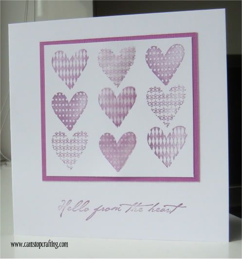
The stamp is a 99p cheapie from g-studio
Versamagic Purple Hydrangea Ink
Coredinations Pansy Purple card
Sentiment Hero Arts
For a bit of added dimension, I coated the middle vertical line with Glossy Accents.
Have a great week everyone.
Suze xx
29 comments:
Wow, this card is lovely! I like it much better than mine! I think I will have to have another try...:( Hugs, Valerie
just love this faded pink effect!
Sarah at 162
I love that stamp, what super patterns, they look fab, faded, very shabby chic, so on trend!
Thank you
Diva LIM mandi
"Less is More"
Love this gorgeus card - simple but effective.
Terrific stamping and placement. Great card, Annette x
The hearts look great in the purple. Well done on your repeated stamping! x
Excellent card and beautifully stamped
Beryl x
This is beautiful, a really lovely card. Jo x
beautifully done, works perfectly
Great job on this challenge! I love the different patterns on these hearts!
Fabulous card and a great idea, love the colour choice and the stamps.
Kath x
Love this striking design, love the colour too.
Jenny :)
Great idea I bet the glossy accents show more IRL
and make a super card. Sue x
Brilliant card, Liz x
Great idea, if you don't have what you need, be inventive! Lovely card, Judith xx
This looks really great, you have interpreted the challenge really well.
Thanks so much for joining us.
Chrissie
Lady LIM
"Less is More"
I love it Suze - the pattern really pulls the eye. Vx
This is really lovely. Carol x
Lovely card Suze love the effect, never thought of using just one colour before but i think the effects are lovely
You can view mine at
http://janetscraftycreations.blogspot.com/2011/06/monochrome.html
A brilliant effect achieved with the bargain basement stamp - 99p, I'm going shopping with you LOL.
Wishes
Lynne
Fabulous card Suze - that stamp was a real bargain - well done you!
Hugs, Sylvia xxx
Hello suze thank you for to visit my blog last week, i'm happy to see you.
FANTASTIC CARD!!!beautiful design and wonderful colours, Good work Suze, i love it.
a hug from Palma Island
A pretty card and love the colour. Dianne
I really love this card. Beautiful choice of color.
Hi Suze, Well this is a thing of beauty:0) I love how you've shaded the inks to achieve a gorgeous effect on your hearts, really pretty, Gay xx
Wow love the card and all the patterns Suze, great as usual
ooh it's lovely - very CAS.
Linbyx
Suze...this is fabulous! I LOVE the "textured" look you achieved. Perfectly wonderful!
Susan@Keeping in Touch
this is one brilliant card,love the texture you have achieved on this love cheryl xxxxx
Post a Comment