I have to say I'm not sure if I like them. Think maybe black & white is just too boring! The first one's okay but I'm not happy with the second one, it just doesn't seem balanced.. Think either the bling is too 'heavy' or I maybe should have coloured the bird?
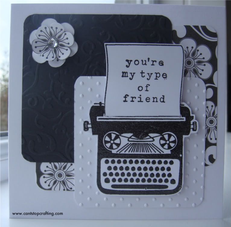
Stamp - Hero Arts 'My Type' (clear embossed)
Patterned Paper - Paper Cellar
Embossing folders - Swiss Dots & Victorian Fleur
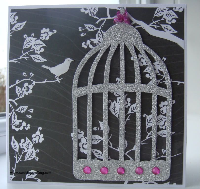
Silver Glitter Paper cut withTim Holtz Die - Caged Bird
Patterned Paper - Paper Cellar
Glossy Accents (on the bird) & Bling
So what do you think - please feel free to comment, sometimes it just needs a fresh pair of eyes.
EDIT: Have cut out another bird, coloured it and stuck it on top. Still not happy with it though, think the bird's too small (or the cage is too big)!!

Happy Crafting
Suze x
5 comments:
I like them both. Black and white can be very dramatic. I don't think your bling is too heavy but see what you mean about the little bird. If he was lightly coloured he would be more central to the picture and look like he's escaped from the cage. Sorry Im being as concise as ever!! x
Yes, I think it is the bird. Thing is, I've coated him with glossy accents but I'll see if I can add a bit of colour to him.
Your bird looks much better. I may have coloured him in same as your gems but perhaps that's being too picky. Don't think the difference in sizes is any problem. Anyways it's still a lovely card. I fretted over the position of my balloons on my last card after I'd stamped them but oh well...... x
Wow love both f these cards x
Both cards are beautiful, and I like the monochrome, it works!
Post a Comment