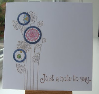
A later entry than usual this week for the Less is More Challenge as we were away for the weekend, plus it's taken a day and a half for me to think of an idea and produce something. The theme this week is "Circles (more than one!)"
I wanted to do something different, so this is my first attempt at the 'Spotlight' technique and I don't think I've got it quite right!
My first attempt, the circles are too small and don't have enough impact
My second attempt is better, though still not quite right.
Should I have spotlighted a whole flower (rather than just part) or maybe it would look better with just one large 'spotlight' (which wouldn't be allowed for this week's challenge!)??
Image is Kanban, stamped in Versafine Sepia.
Sentiment Papermania
Coloured with Promarkers and Sakura pens.
Thanks for visiting and enjoy the rest of your week.
Suze xx


32 comments:
Well I love both of them Suze. They both look great and I wouldn't change a thing on them,.......and no I wouldn't have used just one large image either:O) Viv xx
Hi Suze, me again. Just been thinking about my previous comment and then relaised it did'nt make sense. I should have written 'spotlighting the whole bloom would look great if there was a large bloom to spotlight, then you could also spotlight as you have done here'. Am I making sense second time round? Maybe not. Take care. Love Sheila in Cyprus x
I like them! Hugs, Valerie
Oh Susan ,I like this technique - so guess what it goes on the to do list! hee he and I can't see what's wrong with them they look brill to me,and just when I was feeling happy about mine...:-) x
great idea to spotlight ! x
I think they're both absolutely perfect. I will try this technique, thanks for the inspiration,
Claire x
This is a lovely idea Suze, not seen it before. I like it. Dianne.
Ooh I love 'em both and prefer the smaller one. I think it's much more interesting not to spotlight one flower, gorgeous cards
Anne
x
They are FAB Suze
Spotlighting just means to do just that, Spotlight one section of the design. the fact you haven;t done the whole flower head makes no different...not in my book anyways. That's so my kinda thing
Brilliant!
Fabulous cards XOXO Zoe
I like this technique too - another thing to try - and actually I prefer the top one with the three circles. x
Love it! The 'popped' coloured images look gorgeous!
I agree with you that the second one is better, but I think that your final suggestion of spotlighting just one area is the best idea of all.
If you try one like that I would be interested to hear what you think.
I don't feel you need to spotlight a whole flower, the way that you have done it is perfect.
Hi Suze, Gorgeous cards, I think the second is marginally better than the first because the spotlighted section's larger and has more impact but they are both brill. Well done for using this lovely and different technique, hugs Gay xxx
Just having part of the image highlighted makes much more of an impact. Both gorgeous but 2nd one appeals to me just a little bit more. Thanks for the inspiration.
I think it looks perfect with parts of the flower showing through the circles and I love the pop of colour too :)
Jenny x
Love them but i prefer the second because of the colours!
GREAT CARD!
Debby
Hi Suze. Lovely cards.
Florence x
Two great cards, like the idea.
I think I would also go for the second one.
Kath x
Your spotlight cards are just fab !
:) x
Wow, your spotlighting is a great idea! Beautiful!;)
Beautiful cards - love the spotlighting
I like the fact that you haven't spotlighted (spotlit?) the whole flower... both great though
Wow! These are just stunning! I love them both, but probably slightly prefer the second because of the colours. Fabulous!
Gorgeous, perfecto. I think you've got them bang on!
Lovely cards. You have reminded me of an idea that I had ages ago using this technique. Will have to give it a go as yours have turned out so well. Lilian
I love them both, especially the second one. I like the spotlights being off centre from the flower.
Fiona x
These are adorable, Suze!
:)
Hi Suze I don't know how I missed this post !!! This is so clever and original well done you I love them both.
Marie
These are fab cards Suze, I didn't get around much last week and missed this, silly me, I love them
These are fab, great use of the technique.
Linbyx
Post a Comment